Monday, 17 December 2012

Filming Plan

Me and Molly have discussed the final plans on filming our title sequence. We have looked at who will be best suited to direct the film, and who will be the producer. 

LOCATION
The location will be at my house, as we all feel it has the right atmosphere and a lot of the props needed are already there. 

TIME
It will be filmed in the evening time, around 4:00pm onwards. We feel that if the setting is darker, the whole thing will be a lot more atmospheric which is how we intend our title sequence to appear. 

PROPS
  • Cigarettes
  • Desk/table
  • Lamp
  • Ashtray
  • Paper/notebook
  • Fancy pen
  • Chair
ACTORS
We have also decided who will be acting in our title sequence. Todd Harding will play Finn, and I will be playing Arrow. We chose these people to act in our title sequence because they fit the original characters, -Joseph Gordon Levitt and Rooney Mara- quite well. 

We have decided we will film with a Flip Camera. 

The director and person filming our title sequence is MOLLY RUBY.
The producer of the title sequence is DAISY PRESTON. 


Wednesday, 12 December 2012

Questionnaire - audience researching


 We are going to carry out a questionnaire to generate an overall opinion on the choices of music we have collected to use for our title sequence. I think this is a sensible thing to do because we will not only be basing the title sequence on what we think will work. 

MUSIC QUESTIONNAIRE

I will play a selection of people 4 of my final choices of the music we are contemplating to use for our title sequence.

If you were to hear this song in a title sequence, what genre would you expect the film to be?

What do you think the initial mood of this piece of music is?

What kind of films have you heard music similar to this being played in?

What kind of themes would you relate to this piece of music?

Typography - FONT IDEAS


We looked at different types of fonts online, and we came to the conclusion that these seven may be good to use for the credits appearing on the page. We wanted the writing to look handwritten, as the title sequence is based around the writing of a letter. We also needed the handwriting to look a bit more feminine and joined together, as it will me a female delivering the writing of this letter. I believe the typography will be a big factor in this title sequence, it will deliver the theme and genre of the film as it is embedded into the sequence itself. I personally think the first example of writing would work well as is depicts a sense of desperation in the writing and it looks very rushed. However, you can still see it looks feminine which also makes it work well for the font of our credits and the letter writing. Another one I like is number 6, as it looks as though the is has been written for a long time as the writing is sketchy, and does not all link together. I personally think the first font is the best, but it depends on the opinions of the rest of the group in the final decision of what font to use. 

Monday, 10 December 2012

10th December - typography and sound

In todays lesson we are looking at typography and the soundtrack for our title sequence. 
We are going to look at different types of music that may be different but will still go with the title sequence. We will also do the same with the types of fonts we find. We will then choose a final font and sound that we think will fit with our title sequence the best. 


the website we are on for finding a piece of music is:
https://audionetwork.lgfl.org.uk/

the website we are on for finding a font is:
http://www.dafont.com/

Thursday, 6 December 2012

FINALISED IDEAS- title sequence

This is our finalised plan for our title sequence. I feel that we developed our ideas well, and our title sequence will be quite successful. We all played a big part in the development of this title sequence, which makes us all a lot more engaged in this task. We will split the roles within the group, and do research on what will be needed for the sequence. Overall, I think we all worked very well together to get our finalised idea, and if we maintain the good cooperation within the group the title sequence will overall be a lot stronger. 

BRAINSTORM- title sequence


We brainstormed ideas for the title sequence of our film and what thought about what it should include. In our title sequence we didn't want to give too much away, so we thought it would be best to keep it very simplistic. Although at first, the initial idea I had for the title sequence was completely different but once we all came together and discussed our ideas everything then came together quite well. We will then narrow down our ideas to reach our final decision on what will be used for the title sequence of our film.

Wednesday, 5 December 2012

Importance of typography

Recently, in class we looked at the importance of typography in title sequences. Often enough, the actual words link into the title sequence and play a big part in how the sequence flows. We looked at the title sequence of the film Catch Me If You Can. This title sequence is very much driven by the typography and the way the words are placed on the screen deliver aspects of the films genre and possibly could foreshadow events in the film. The credit font elongates and forms the illustrations in the sequence. For example, the word will stretch down and then the line of the letter will act as a door that people walk out of. The font of this title sequence also shows that it isn't going to be a serious film, as the round and boldness of the font brings out the comedic genre of the film. This is another thing we looked at. Depending on the way the font looks, it often depicts the overall genre of the film. It may also signify what age or gender it will attract. For example: Horror films often have the font appearing to signify death and danger by the lettering being BIG AND BOLD which shows it is inappropriate for a younger audience. (despite this, there is also the certificate that displays this but still..)The horror font often has blood and maybe weapons are used to shape the lettering. 


This is a prime example of typical typography for a horror film. It is bold and sketchy,the use of blood and a weapon also shows the genre of this film. I believe the horror genre is the easiest to display in the font as the characteristics of a horror film are easily distinguishable, whereas a genre of comedy or drama may be more subtly shown through the font. 

horror-movie-poster-lettering-1980-mothers-day.jpg


CATCH ME IF YOU CAN TITLE SEQUENCE :

Thursday, 29 November 2012

Title sequence analysis - Romeo and Juliet


Romeo and Juliet – title sequence (1995)
Genre - Greek tragedy

The genre of this film is constructed through the narrator of the film, who has taken upon the role of a news presenter. The prologue of the play is used as the opening news story being watched from a TV set. This immediately indicates the modern take this film has on the play, however the prologue still remains the same old dialogue.  In a typical news story, there is a picture relating to the topic. In this news story, the picture is a ring broken and underneath reads ‘starcrossed lovers.’ This also sets the genre of the film to be romantic.
The fact that a news report is used also foreshadows criminal activity or danger, as that what the news is usually associated with. The music associates it closely to religion, with loud church choir singing. The figure of Jesus is also shown throughout the title sequence, and in between the Montague and Capulet buildings. This immediately shows there is a direct link towards religion in the feud between both families. Short clips of fighting scenes and what appears to be a war of somewhat are in the title sequence, with the whirring of a helicopter and police sirens overhead. In the title sequence, all of the main characters are introduced, apart from Romeo and Juliet. This may be seen as an enigma of the film. The typography  of the film is also very religion based, with the use of a crucifix as the ‘+’ 


http://www.artofthetitle.com/title/william-shakespeares-romeo-juliet/

Monday, 19 November 2012

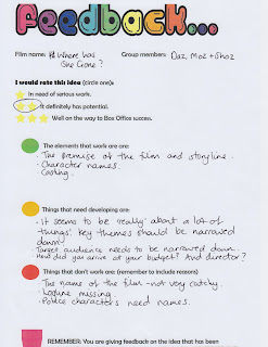
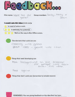
Pitch Feedback


After receiving this feedback from the pitch of my film, it has become apparent that there are a few things that need to be worked on for this film to become successful.
This includes the budget for the film and the film name. Overall, good feedback was given, generally about the plot of the film and the cast. We also needed to research more on the director for the film as we were unsure on how experienced they are in this genre of film. We also lacked in research for the budget for this type of film as we looked at the cost of a film similar to this but was made a long time ago. We came to the conclusion that the film will cost around £80 million, opposed to £20-25 million. We also decided that our film name was not good enough, and it would not appeal to any type of audience as it is very general and lacks creativity, I also don't think it relates well to the genre of the film .

Where Has She Gone - Film Pitch


Continuity Sequence and evaluation


Evaluation


We had to carry out an exercise to create a continuity sequence where we had to film and edit. We had to include the shots: ''shot reverse shot'' and ''match on action.'' We had to film a character walking up to a door, opening the door and sitting down to have a conversation with another person. We also had to ensure we stuck to the 180 degree rule. Overall, I found this task quite enjoyable to film, as we made it more interesting by involving more drama. However, I feel as though I struggled in editing the continuity sequence together in Final Cut Pro as it required a lot of patience and it had to run together smoothly otherwise it wouldn't be successful. I think my continuity sequence could have been edited better  to make it better overall. 

Thursday, 15 November 2012

Art Of The Title - homework

'A great draftsman and visual storyteller, Saul Bass ran the gamut of techniques for his title sequences: montage, live action, cut-out paper animation, typography in motion, to name a few.' I find this interesting because it shows how unique the works of Saul Bass were. There were a number of factors that contributed to his successful title sequences. 

'The idea for using cigarette packaging for the opening sequence was suggested by the film’s director.' Considering the film is called 'Thank You For Smoking' I believe the iconography used in the title sequence is very simple, but it works well.

 'European cinema was deeply influenced by modernism, and aspects of this visual sensibility were brought to the US by filmmakers who were fleeing the Nazis.' I find this interesting because it brings aspects of historical knowledge and understanding into the production of film making. It will also be popular with the public as often non-fiction based films on major historical events sell well.